Happy New Year to my stamping friends!!. I am so grateful for the inspiration and fun that comes from visiting your blogs and only hope that I can give back a teeny bit of that pleasure. I have been very lax this entire year...I was going to say this past month...but I still plan to upload a card now and then and keep this little area of stamping and every once in awhile a story or thought, alive!
I made this card awhile ago and the design isn't an original. I sent it along with a fun care package to a dear online friend.
I used the Stampin' Up "Free as a Bird" set along with the enclosed die which I think is a very handy size. The birds and branch are colored with copic markers and a little bit of the leaf pattern was stamped in the background with coordinating ink. This made a cute card in fairly quick time which is what I am going for these days.
I think it's an appropriate saying as it is so true of so many online stamping friends...thank you for your visit and wishing you many blessings in the year ahead.
Showing posts with label hand stamped cards. Show all posts
Wednesday, January 1, 2020
Tuesday, June 4, 2019
Special Friends
Gosh, it's been awhile I know! I have a few cards in the lineup but haven't been near my computer for awhile. So for today's menu...*I think I have food on my mind, it is almost lunchtime*..I have a new item to show before I send. This is a recent purchase from Penny Black called "Special Friends." I love so many Penny Black stamps and just finally purchased a few from a recent release. The sweet animals in this set appealed to me!
I also had purchased this embossing folder-looking trellis (Stampin' Up!) and was trying to find a creative way to put it to use. I just embossed the white card front and then brushed green ink lightly over the raised portions. The tiny pink Prima roses were added to maybe resemble flowers growing on a vine...though with these types of images you can't be too literal. I colored the bunny and squirrel with copics and cut them out by hand...then added a tiny banner with the words, "just because" and a tiny green pearl accent. The card is popped up on green which is popped up on white...making for a dimensional card.
I have to say...my yard is a veritable Bambi scene most days with all kinds of woodland creatures...but I have yet to see a bunny and a squirrel coming near each other. Though they often fight for the same food sources and I can see them scampering in the same general area...I have yet to see them hug. Which is why I like stamps, I guess. It feeds my imagination that all creatures are filled with love and goodwill given to them from their Creator!
As always I appreciate your visit and kind comments! I am so happy to be able to sit down and share a new card! Wishing you a blessed day, friends!
Friday, May 3, 2019
Pardon My Purple!
Well, it's finally Spring here in Northern Colorado...it has been a very long winter and I am enjoying the past two days of Spring like weather. The Pear trees are bursting forth in bloom and I need to go get a photo of those quick before the wind blows them away! We have Lilacs right under our deck where we have our morning coffee and they are so heavenly when they bloom. I saw Power Poppy had a sale on this set "Lilac Time" last weekend...and it just reminded me to pull mine out and use it.
It may be hard to see any detail on those blooms as they were gold embossed which left little space for shading, etc...but I used a variety of lilacs and purples using my Zig Markers to watercolor these and also the tiny ladybug on that leaf...so fun! I also used a new to me embossing folder from Stampin" Up on the purple layer...it gives the base a tufted look which is very feminine. The panel was given a gold liquid pen treatment along the edges and then an organza ribbon and matte colored gems were added. The sentiment is from Power Poppy's set, "Potted Primroses." The entire image was splattered with some of the watercolor and it gave a nice little splattering of color without overwhelming the main image. I had initially created this card for the April challenge but I ran out of time posting it...so here it is. I am sure I will have an occasion to use this!
For some reason a lot of people comment on my purple cards by prefacing that they don't really like purple..but they like my card...which always makes me laugh and hence the title of this post.
I love purple...but lilac is even better in my book!
I am so happy you stopped by and hope you enjoyed your visit. Thank you!
Have a beautiful day and hope you get to be out and enjoying Spring in your part of the world!
It may be hard to see any detail on those blooms as they were gold embossed which left little space for shading, etc...but I used a variety of lilacs and purples using my Zig Markers to watercolor these and also the tiny ladybug on that leaf...so fun! I also used a new to me embossing folder from Stampin" Up on the purple layer...it gives the base a tufted look which is very feminine. The panel was given a gold liquid pen treatment along the edges and then an organza ribbon and matte colored gems were added. The sentiment is from Power Poppy's set, "Potted Primroses." The entire image was splattered with some of the watercolor and it gave a nice little splattering of color without overwhelming the main image. I had initially created this card for the April challenge but I ran out of time posting it...so here it is. I am sure I will have an occasion to use this!
For some reason a lot of people comment on my purple cards by prefacing that they don't really like purple..but they like my card...which always makes me laugh and hence the title of this post.
I love purple...but lilac is even better in my book!
I am so happy you stopped by and hope you enjoyed your visit. Thank you!
Have a beautiful day and hope you get to be out and enjoying Spring in your part of the world!
Monday, April 29, 2019
Joyful Birthday Wishes!
Hi friends...it's getting to be that time...the end of the month and I have two more cards to squeeze in to this month's Power Poppy Creative Confetti Challenges. My card is for the "Think Spring Challenge." I needed a birthday sentiment to fit into this pretty gold frame and searched my stash high and low...and then came upon this little sentiment with the sweet and cheerful font by Power Poppy by Marcella...I had to use it! It fit just right and added a bit of whimsy to the somewhat serious and sophisticated Peonies. :)
This is from one of my favorite Power Poppy stamps, "Potted Primroses." The sentiment was gold embossed in rose gold powder on vellum and then attached to the back of the gold frame. The frame was then framed with a larger Spellbinders die. The peonies, from Altenew, were stamped and then gold embossed and added to each corner. The entire card was mounted on a linen white card stock from PaperTrey Ink. A few pearls and sequins added for a bit of sparkle!
Here is a little close up:
I made this card a little oversized for our daughter's 32nd birthday! I was so happy that it turned out so well...and that was in huge part to finding the perfect sentiment!
I always appreciate you popping in and wish you a creative day! Blessings!
Wednesday, April 10, 2019
Creative Confetti Challenge "On the Grid"
Hi friends. I am going to quickly share a card creation today for Power Poppy's Creative Confetti Challenge~"On the Grid."
I decided to use a copy of an original copic colored Columbines from the oh so cute "Cup of Columbine" by Power Poppy just in case I messed up the colored copy in the cutting process. (Because...yes, I do and I did.) Anyway, after I made a copy of my colored image...I then added highlights and shading to the copy and then used a sliver of paper as Julie explained in her excellent tutorial as spacers. I decided to back the image in blue because I had a lot of blue in the Columbines.
It was hard to capture this in the photo...but I made doubly sure to line up the bird's beak and top of his head so it wouldn't look too wonky and that helped the whole image. Since there was quite a bit of white space in both corners...I had the idea to add sentiment banners on both ends taken from the set, "Folk Heart." Oh my heart...I decided to color pearls to match the blue in the Columbines using a blue copic marker also and it is so cute in person! A twine bow along the side to add to the natural look and there you have it.
This was fun and I may try it again before this month's challenge is over!
And here is a picture I took while walking in our Botanical Gardens of some Columbines...I definitely need to try this image again in these lighter shades of lavender blue.
Thanks for your visit and always enjoy reading your comments and what you're up to! Blessings on your day, friends!
I decided to use a copy of an original copic colored Columbines from the oh so cute "Cup of Columbine" by Power Poppy just in case I messed up the colored copy in the cutting process. (Because...yes, I do and I did.) Anyway, after I made a copy of my colored image...I then added highlights and shading to the copy and then used a sliver of paper as Julie explained in her excellent tutorial as spacers. I decided to back the image in blue because I had a lot of blue in the Columbines.
It was hard to capture this in the photo...but I made doubly sure to line up the bird's beak and top of his head so it wouldn't look too wonky and that helped the whole image. Since there was quite a bit of white space in both corners...I had the idea to add sentiment banners on both ends taken from the set, "Folk Heart." Oh my heart...I decided to color pearls to match the blue in the Columbines using a blue copic marker also and it is so cute in person! A twine bow along the side to add to the natural look and there you have it.
This was fun and I may try it again before this month's challenge is over!
And here is a picture I took while walking in our Botanical Gardens of some Columbines...I definitely need to try this image again in these lighter shades of lavender blue.
Thanks for your visit and always enjoy reading your comments and what you're up to! Blessings on your day, friends!
Monday, March 11, 2019
An Attempt at Masculine with Altenew Stamps~
Hi visiting friends...I admit I wasn't sure about adding this card to my blog...like any card I make...at first I am smitten with just the joy of seeing ink on paper...but after awhile I felt it might be a little too drab or plain...but I am going to use this as a masculine card and think it works well if I leave well enough alone...and I'm sure you know what I mean.
This is an Altenew image with outline and solid leaf prints. I fell in love with it when I saw the DT samples...however...the reason I finally made the plunge to hit that purchase button is one single entry on the website that was so unique and beautifully embossed with a triage of powders...but do you think I can find that saved anywhere at all?
So...this is just a plain ole card...stamped and embossed in Copper metallic and colored in with Tim Holtz Distress Inks in three shades. I saw this "blessings" set sitting out and decided at the end to add that along the leaf border and it worked! Then I dared myself to splatter the ink...and I did...just holding my breath that it didn't make a huge mess and so I went very lightly. I used the rough side of the watercolor paper for more texture. After I was finished, I trimmed the panel on both sides and popped it up on a Kraft card base.
This is an understated card, but the metallic embossing and the bold colors look very masculine to me.
Thanks for visiting me today!! I hope your day is full of blessings!
This is an Altenew image with outline and solid leaf prints. I fell in love with it when I saw the DT samples...however...the reason I finally made the plunge to hit that purchase button is one single entry on the website that was so unique and beautifully embossed with a triage of powders...but do you think I can find that saved anywhere at all?
So...this is just a plain ole card...stamped and embossed in Copper metallic and colored in with Tim Holtz Distress Inks in three shades. I saw this "blessings" set sitting out and decided at the end to add that along the leaf border and it worked! Then I dared myself to splatter the ink...and I did...just holding my breath that it didn't make a huge mess and so I went very lightly. I used the rough side of the watercolor paper for more texture. After I was finished, I trimmed the panel on both sides and popped it up on a Kraft card base.
This is an understated card, but the metallic embossing and the bold colors look very masculine to me.
Thanks for visiting me today!! I hope your day is full of blessings!
Friday, March 8, 2019
A Teacup of Spring~
Most of my stamping is for no particular reason...sometimes I come across a stamp that brings a sense of sweetness or nostalgia. This one from Stampavie by artist Tina Wenke does just that!! I see they no longer make the stamps...but there is a spot to find lots of digital which I may try soon! I made a 3x3 note card and added just a bit of designer paper (because that is all I had of this scrap )so it served as a border...and some twine across the top of the card. I practiced my water coloring with this image...using my Zig Markers. Except this time I scribbled my markers on a clear block and then used a brush to add to my panel rather than applying directly. I loved the way it turned out and found it much easier than the times I've attempted with copics. I may try a larger card but for today this is perfect for my needs...just the right size to add a gift card in the mail.
The note card die is from Papertrey Ink. I can tell I will be using this often.
Wishing you a warm and wonderful day filled with a bit of beauty! Thanks so much for your visit today!
The note card die is from Papertrey Ink. I can tell I will be using this often.
Wishing you a warm and wonderful day filled with a bit of beauty! Thanks so much for your visit today!
Wednesday, December 5, 2018
Corgi Christmas Cuteness!
Hi there! Just doing a quick post today...we just returned from our mountain condo in the hopes of getting a little bit of Christmas decorating done. It is a 3 1/2 hour drive...more like 4 for me as I drive slower than I used to. Tom and I spent 3 days and decorated our tall and skinny mantle tree and the mantle also...and wrapped gifts. Now I am wondering if we should have not left the gifts there because there is always the possibility that we won't make it for Christmas. I had told our grown daughters that we could have the holiday there this year as for them it would be a 4 day break and everyone skis but me.
Well, either way...I had fun making this adorable Corgi stamp into a small Christmas card!! I envisioned a dark sky with the galaxy of stars behind it...well let's face it...all this is on the far side of pretend. But I couldn't resist a Corgi with antlers!! This is a Power Poppy set called, "Christmas Corgis." We had a Corgi dog named Copper for many years...and he was a handful to put it mildly. But they are cute as can be~
The gold against the black is a new product for me...Nuvo Embellishment Mousse. I used a Tim Holtz stencil and just added a bit of the mousse over it. The gold mirror card stock was cut from a Papertrey Ink die. The bow was fussy cut and is from a set from their corner rounder series: October.
The funnest part was coloring in the Corgi with Copics and I added a few eyelashes with a black micron pen. No sentiment on the front...but the inside reads "Merry and Bright" in the same hot pink as the outside gingham card stock.
And here is a picture of our Beulah and oldest daughter's dog, Daisy in front of the tree we decorated. This sweet scene only happened because Tom was dangling treats above their heads to encourage them both to look in the same direction while I scrambled to get a photo on my camera phone. And this is the only one that didn't have his leg in or one of their faces chopped out of the photo.
That is it for today! I am not sending a bunch of hand stamped cards this year. I have had a painful condition on my right hand, "trigger finger" which seems to be more irritated than normal and so trying to give it a bit of rest. I am just grateful to be able to continue to do this hobby that I love.
Thanks for your visit. Wishing you lots of merry moments in your days!
Well, either way...I had fun making this adorable Corgi stamp into a small Christmas card!! I envisioned a dark sky with the galaxy of stars behind it...well let's face it...all this is on the far side of pretend. But I couldn't resist a Corgi with antlers!! This is a Power Poppy set called, "Christmas Corgis." We had a Corgi dog named Copper for many years...and he was a handful to put it mildly. But they are cute as can be~
The gold against the black is a new product for me...Nuvo Embellishment Mousse. I used a Tim Holtz stencil and just added a bit of the mousse over it. The gold mirror card stock was cut from a Papertrey Ink die. The bow was fussy cut and is from a set from their corner rounder series: October.
The funnest part was coloring in the Corgi with Copics and I added a few eyelashes with a black micron pen. No sentiment on the front...but the inside reads "Merry and Bright" in the same hot pink as the outside gingham card stock.
And here is a picture of our Beulah and oldest daughter's dog, Daisy in front of the tree we decorated. This sweet scene only happened because Tom was dangling treats above their heads to encourage them both to look in the same direction while I scrambled to get a photo on my camera phone. And this is the only one that didn't have his leg in or one of their faces chopped out of the photo.
That is it for today! I am not sending a bunch of hand stamped cards this year. I have had a painful condition on my right hand, "trigger finger" which seems to be more irritated than normal and so trying to give it a bit of rest. I am just grateful to be able to continue to do this hobby that I love.
Thanks for your visit. Wishing you lots of merry moments in your days!
Labels:
Corgis,
hand stamped cards,
Power Poppy ! Christmas
Wednesday, October 31, 2018
Creative Confetti~Sparkle in the Shade!
Hi there! I decided to submit a card for Julie's challenge on Power Poppy to "Sparkle in the Shade," using one color on a card and adding a bit of sparkle.
So...for this card I decided to do a little square card using this adorable border from the set, "Snow Kissed."
The square was then mounted to a fun square die to add the scallops around the perimeter! I am having so much fun with these Creative Confetti Challenges!
I so appreciate your dropping in and appreciate your kind comments.
So...for this card I decided to do a little square card using this adorable border from the set, "Snow Kissed."
I stamped the border three times on the top and bottom portion of my card with Stampin' Up's Cherry CobblerThen I added a few tiny rhinestones in the center of each large star. The "Merry Christmas" is from Papertrey Ink as it was the best fit
!
I so appreciate your dropping in and appreciate your kind comments.
Monday, October 15, 2018
Creative Confetti with Power Poppy~Background Check
Happy Fall Y'all! Well, around here...Fall has fled and winter came in with a vengeance...outside my window is a bit of a sloppy mess with leaves all over the ground in a wet, snowy, puddle. Which is why I'm not featuring pumpkins today! :) I actually do love creating Christmas cards year round; and I'm determined to use up paper, stamps, and die cuts that I have collected before purchasing (too much) in the way of new supplies!
Julie from Power Poppy gave us a fun challenge earlier this month called"Background Check."
My card today uses two stamps from Power Poppy to bring you this little Cardinal and a Tree in a Teacup surrounded by a wintry branch scene:
I used some beautiful paper purchased at the end of the season last year: Wild Rose Studio: Birds and Berries. I stamped the Tree in the Teacup and the Cardinal holding branch from Power Poppy's "Cozy Cupfuls" and colored them up with copic markers. This is the sweetest set and I've used it for several cards. I had planned on making two different cards but after cutting out the background die (Papertrey Ink,) I decided to perch one of the cardinals nesting in the "branches." The sentiment is from "O Holy Night." The die was centered over some pretty sky blue paper; and both the images were glued down to the paper afterwards. The sentiment is popped up on some dimensionals and a bit of glittery stickles added to the ornaments and berries.
I made another Christmas card and if all goes according to plan...I hope to share soon! Wishing you a
day of blessings! Thanks so much for dropping by for a visit!
Sunday, October 7, 2018
Christmas Traditional Red and White!
Well, hey there! I decided to join in this month's October Christmas Challenge using two colors for our card...that was a pretty easy choice for me as I love red and green at Christmas!
I turned to one of my favorite sets from Papertrey Ink, A Cup of Cheer!
I have begun the habit of die cutting multiples and using my Misti to stamp as I can get more saturated ink. I also used a new to me Holly embossing folder for the background!
I can't believe I was able to combine three stamp sets...but decided the sentiment in the oval works with the other two sets when stamped in the green and the red rhinestones added. What do you think?
I'm also entering my card on the Simon Says Stamp Wednesday Challenge blog!
I can't believe I was able to combine three stamp sets...but decided the sentiment in the oval works with the other two sets when stamped in the green and the red rhinestones added. What do you think?
I'm also entering my card on the Simon Says Stamp Wednesday Challenge blog!
Card Recipe:
Stamps: PTI: A Thrill of Hope, PTI A Cup of Cheer, PTI Spruce and Sprigs
Paper: PTI white, PTI Green dot
Ink, SU! Real Red, SU! Hunter Green
Other: Holly Embossing Folder, Oval Dies, and German Glass Glitter for the Red Berries,
Red Rhinestones
Friday, September 21, 2018
Snow Kissed Snowman!
Hi friends! This is my second post today...I finally uploaded a card for the Dare to Get Dirty forum for monthly Christmas Card challenge and realized I should put it here also. I do love making Christmas cards...although I also send out some really cute boxed cards...for special friends and family I do hand deliver or mail out a hand stamped Christmas card!
This is the snowman featured in Power Poppy's set, "Snow Kissed." I adore this set and have made a few cards from it...but this is my first snowman. I actually water colored this up and then added a few prisma pencils for shading. I also used a bit of shimmery white for the highlights of the snowman in water colors. I am really enjoying water coloring right now.
I just ran out of this red ribbon...it is my very favorite from Stampin' Up and I've had it awhile in the Cherry Cobbler red. My snowman looks a little small here...I think it's the angle. I added some filigree die cut snowflakes sprinkled in glitter and a rhinestone that I colored up bright red with a copic marker!
Thanks so much for your visit...I always enjoy reading your kind comments. Blessings on your day!
This is the snowman featured in Power Poppy's set, "Snow Kissed." I adore this set and have made a few cards from it...but this is my first snowman. I actually water colored this up and then added a few prisma pencils for shading. I also used a bit of shimmery white for the highlights of the snowman in water colors. I am really enjoying water coloring right now.
I just ran out of this red ribbon...it is my very favorite from Stampin' Up and I've had it awhile in the Cherry Cobbler red. My snowman looks a little small here...I think it's the angle. I added some filigree die cut snowflakes sprinkled in glitter and a rhinestone that I colored up bright red with a copic marker!
Thanks so much for your visit...I always enjoy reading your kind comments. Blessings on your day!
Saturday, August 18, 2018
Cheerful Columbines~Creative Confetti!
Hi friends! I can't believe we are in the middle of August...I have been a little on the slow end to get things here on my blog lately! It must be those lazy days of summer kicking in!
This month Power Poppy's Challenge is a new "Creative Confetti" and my Cheerful Columbines card is an attempt to add a little glow to my flowers and the entire image...with yellow added in. You can find Allison Cope's video tutorial here.
Although I am enamored by this Columbine image I will readily admit it's posed a coloring challenge for me! It is a bit more to color on and shade and highlight...and when I went to trim it for the life of me the image seemed tilted and still does. So here's my tilt a whirl card...I added a sentiment set a bit more straight on top to hopefully ground it.
I added a bit of yellow copic marker on the columbines and also for highlighting. I also found a perfect green designer paper to mimic the speckling in the egg and some earthy twine to add a bit of rustic charm. I have a lot of practice to get it right...but if I don't stare with a critical eye this card is for certain cheerful and will go to someone that needs a bit of encouragement!
Thanks for stopping in...I would so appreciate your comments!
This month Power Poppy's Challenge is a new "Creative Confetti" and my Cheerful Columbines card is an attempt to add a little glow to my flowers and the entire image...with yellow added in. You can find Allison Cope's video tutorial here.
Although I am enamored by this Columbine image I will readily admit it's posed a coloring challenge for me! It is a bit more to color on and shade and highlight...and when I went to trim it for the life of me the image seemed tilted and still does. So here's my tilt a whirl card...I added a sentiment set a bit more straight on top to hopefully ground it.
I added a bit of yellow copic marker on the columbines and also for highlighting. I also found a perfect green designer paper to mimic the speckling in the egg and some earthy twine to add a bit of rustic charm. I have a lot of practice to get it right...but if I don't stare with a critical eye this card is for certain cheerful and will go to someone that needs a bit of encouragement!
Thanks for stopping in...I would so appreciate your comments!
Sunday, July 29, 2018
Power Poppy~Inspire Me! July Challenge
Hi friends! I had to make an appearance for this month's July Power Poppy Challenge-Inspire Me! There is always so much inspiration; but this time I found a retired Bloomie, Leslie Miller, to follow as my inspiration! She showed us how to make envelopes to match our cards...and I must say that even I, the measuring challenged person that I am...was able to do this one! Such easy and clear to follow instructions! The tutorial is here on the Power Poppy "Make it Monday" post.
I used a retired Flourishes stamp for the sweet teacup with some designer paper for the envelope. I have a pretty Prima daisy that I may add as an envelope closure if I decide to hand deliver this card.
Oh, I guess I should show a photo and stop jabbering...
I water colored the cup and saucer...and added just a bit of colored pencil shading. The sentiment is from Power Poppy's "Potted Primroses" stamp set. So cute together! I outlined the word "hello" in a pink copic marker.
The strip of paper is the same I used for the envelope, then I added a wee bit of pink designer paper along the border.
I am a bit rusty in stamping...but so very thankful for being able to revisit my pretty stamps and papers...it is such a relaxing and fun hobby!
And that is it for today! We just visited the Oregon coast last week so I hope to post some photos from our trip here in a couple of days!
Thanks so much for popping in and wishing you a blessed day!!
I used a retired Flourishes stamp for the sweet teacup with some designer paper for the envelope. I have a pretty Prima daisy that I may add as an envelope closure if I decide to hand deliver this card.
Oh, I guess I should show a photo and stop jabbering...
I water colored the cup and saucer...and added just a bit of colored pencil shading. The sentiment is from Power Poppy's "Potted Primroses" stamp set. So cute together! I outlined the word "hello" in a pink copic marker.
The strip of paper is the same I used for the envelope, then I added a wee bit of pink designer paper along the border.
I am a bit rusty in stamping...but so very thankful for being able to revisit my pretty stamps and papers...it is such a relaxing and fun hobby!
And that is it for today! We just visited the Oregon coast last week so I hope to post some photos from our trip here in a couple of days!
Thanks so much for popping in and wishing you a blessed day!!
Thursday, March 15, 2018
Stamping Just Because
Hi there, sweet stamping friends! I have been doing a bit of stamping here and there and can't seem to take the time to actually post on my blog here! I really do enjoy blogging and visiting other's blogs...it is such a creative way to not only gain inspiration...but peek into the lives of people I feel I almost "know" because of their sharing stories, pictures, and kind words.
There are several friends I know who are going through health struggles, both personally and through these blogs. I've made a few cards that are encouragement and faith based that I hope to share in the next few days here.
This one is using a new-to-me set from Papertrey Ink, Brushed Birds. I really liked the sentiment, and I always fall for any type of bird on cards, and this set has several that you can change up the colors any way you want. I have never seen a pink bird...but I kind of like it!
"Serenity is quiet courage."
I recall reading a definition of meekness that stuck with me because it encapsulated the meaning well. The author stated that sometimes meekness is misunderstood as being weak, or one who is easily walked upon, or subjection of wills. But the meaning that was given is "Meekness is restrained strength or strength under control," the greatest of all strengths. True meekness combines gentleness and strength. My Mom possessed this trait more than anyone I know as she dealt with the debilitating illness of M.S. for many years. I saw in her a gentleness, yet powerful strength...something to be admired!
So I am wondering if this serenity definition is similar.
The bird is perched on vines from another PTI stamp set, "Elegant Embellishments." I die cut several small floral and tucked them in here and there. Nuvo gold glitter drops were used in the corners for embellishments that are easy to mail.
Thanks for your visit today and may you be blessed!
There are several friends I know who are going through health struggles, both personally and through these blogs. I've made a few cards that are encouragement and faith based that I hope to share in the next few days here.
This one is using a new-to-me set from Papertrey Ink, Brushed Birds. I really liked the sentiment, and I always fall for any type of bird on cards, and this set has several that you can change up the colors any way you want. I have never seen a pink bird...but I kind of like it!
"Serenity is quiet courage."
I recall reading a definition of meekness that stuck with me because it encapsulated the meaning well. The author stated that sometimes meekness is misunderstood as being weak, or one who is easily walked upon, or subjection of wills. But the meaning that was given is "Meekness is restrained strength or strength under control," the greatest of all strengths. True meekness combines gentleness and strength. My Mom possessed this trait more than anyone I know as she dealt with the debilitating illness of M.S. for many years. I saw in her a gentleness, yet powerful strength...something to be admired!
So I am wondering if this serenity definition is similar.
The bird is perched on vines from another PTI stamp set, "Elegant Embellishments." I die cut several small floral and tucked them in here and there. Nuvo gold glitter drops were used in the corners for embellishments that are easy to mail.
Thanks for your visit today and may you be blessed!
Saturday, March 3, 2018
Power and Spark Challenge~Fabric Inspired!
Hi friends! We're having such balmy pre-Spring weather today!! I know snow is still going to make an occasional appearance...but today the wind is blowing warm breezes.
I just purchased a new pillow for my stamp room! I had acquired a couple of gift cards to Pier 1 so I splurged and this little piece of embroidery brings so much cheer to my space.
So I made a card inspired by my pillow fabric to participate in March's Power and Spark Challenge~using fabric as your inspiration. Allison Cope leads this challenge, and if you visit the Power Poppy blog, she shares a lot of Pinterest inspired boards!
Here is the fabric (just an up close of the pillow.)
I perused all of my Power Poppy stamps and wanted to make a bright card...so I chose the "Folk Heart" stamps and made this card:
I had so much fun with this card, coloring with copics and using a mixture of corals, hot pinks, brilliant blues and sunny yellows! I added a colored button and twine to the top corner and used some fun gingham papers...and I actually think it's one of the cutest cards I've made in awhile. Every once in awhile, I am pretty happy with a card. I really wanted to ground the image, so I just cut out the dies twice with two different different gingham in yellow and coral...and layered the coral gingham to the bottom of the die cut.
That's it, thanks so much for stopping by! I so appreciate it when you do and delight in your comments! Blessings on your day!
I just purchased a new pillow for my stamp room! I had acquired a couple of gift cards to Pier 1 so I splurged and this little piece of embroidery brings so much cheer to my space.
So I made a card inspired by my pillow fabric to participate in March's Power and Spark Challenge~using fabric as your inspiration. Allison Cope leads this challenge, and if you visit the Power Poppy blog, she shares a lot of Pinterest inspired boards!
Here is the fabric (just an up close of the pillow.)
I perused all of my Power Poppy stamps and wanted to make a bright card...so I chose the "Folk Heart" stamps and made this card:
I had so much fun with this card, coloring with copics and using a mixture of corals, hot pinks, brilliant blues and sunny yellows! I added a colored button and twine to the top corner and used some fun gingham papers...and I actually think it's one of the cutest cards I've made in awhile. Every once in awhile, I am pretty happy with a card. I really wanted to ground the image, so I just cut out the dies twice with two different different gingham in yellow and coral...and layered the coral gingham to the bottom of the die cut.
That's it, thanks so much for stopping by! I so appreciate it when you do and delight in your comments! Blessings on your day!
Thursday, February 1, 2018
PTI~Make it Monday!
Just a quick card post today! I am always inspired by Make it Mondays on Papertrey Ink blog~and this week I am actually entering! I know...that never happens...I usually am lagging behind by a couple of weeks.
This week Stephanie challenged us to use different papers on our cards. Well, let me just say...I started with a notebook page with a floral spray...and tried for a bit too long to make it work. Then I just scrapped the idea and began over with my new set, "Life is what you Bake It." Oh my word, is it cute!!
I used some pretty blue tissue paper and a couple of doilies as my "added papers." The doily was actually die cut with a heart die as was the blue tissue paper (layered 3 of them on top of each other)...and then I made a fun pleated streamer to go along the border.The heart has an added floral rhinestone and a few white and clear sequins were sprinkled on top. This is a 4 1/2 inch square card which fits this image pretty well. It looks like a party to me!
Thanks to the inspiration from Stephanie...I got a little outside my normal creative process on this one.
It's been fun visiting...see you next time!
This week Stephanie challenged us to use different papers on our cards. Well, let me just say...I started with a notebook page with a floral spray...and tried for a bit too long to make it work. Then I just scrapped the idea and began over with my new set, "Life is what you Bake It." Oh my word, is it cute!!
I used some pretty blue tissue paper and a couple of doilies as my "added papers." The doily was actually die cut with a heart die as was the blue tissue paper (layered 3 of them on top of each other)...and then I made a fun pleated streamer to go along the border.The heart has an added floral rhinestone and a few white and clear sequins were sprinkled on top. This is a 4 1/2 inch square card which fits this image pretty well. It looks like a party to me!
Thanks to the inspiration from Stephanie...I got a little outside my normal creative process on this one.
It's been fun visiting...see you next time!
Tuesday, December 12, 2017
Snow Kissed Stocking~
Hi friends! Just a quick post here. These past few days the South and East were hit by unprecedented snow...in places like Texas and Atlanta, Georgia, Alabama, and such! Which makes this post even more newsworthy as we live in Colorado...and no snow in sight! We've had 60 degree weather, setting records and actually...I am kind of glad. Because I am planning on a drive over the mountain passes to see my elderly Dad. It's a trip I've often had to cancel as the roads can be bad. And I'm planning on leaving in just a few days. So...here is my nod to snow...
I saw this pretty Christmas~y paper, "Birds and Berries," on Stacy's blog and really loved it. So I bought it...the only purchase of paper I've made for Christmas.
I used the Power Poppy newly released set , "Snow Kissed." It has some darling images! I made this stocking late at night...deciding to stamp it directly on the pink designer paper...and didn't really love it at first. I almost threw it out...but then decided to fussy cut it and added some glitter...and then figured out a die cut to make it stand out a bit more. Now...I really like it...whew! I really don't like to throw things out.
The image was stamped in Momento Gray which gave it a very soft feel. Colored with copic makers...then used ovals and two pieces of the pretty designer paper to mat. A gold tinsel bow was added to the top. The glitter added a lot...but you can't see it too well in this photo! Also, each of the ovals and the stocking were mounted in dimensional tape...so there is a lot of depth to this card!
Thanks so much for stopping in! Do you have any snow in your part of the country?
I saw this pretty Christmas~y paper, "Birds and Berries," on Stacy's blog and really loved it. So I bought it...the only purchase of paper I've made for Christmas.
I used the Power Poppy newly released set , "Snow Kissed." It has some darling images! I made this stocking late at night...deciding to stamp it directly on the pink designer paper...and didn't really love it at first. I almost threw it out...but then decided to fussy cut it and added some glitter...and then figured out a die cut to make it stand out a bit more. Now...I really like it...whew! I really don't like to throw things out.
The image was stamped in Momento Gray which gave it a very soft feel. Colored with copic makers...then used ovals and two pieces of the pretty designer paper to mat. A gold tinsel bow was added to the top. The glitter added a lot...but you can't see it too well in this photo! Also, each of the ovals and the stocking were mounted in dimensional tape...so there is a lot of depth to this card!
Thanks so much for stopping in! Do you have any snow in your part of the country?
Thursday, November 9, 2017
Altenew Florals ~ Couldn't stop at just One!
This will be a quick post with more photos than text...I have a wedding to go to this afternoon! This is the second wedding of my nieces and nephews in a matter of months. I don't know my nephew's fiance very well...but wanted to welcome her into the family with a handmade card.
This new to me stamp by Altenew, Painted Flowers, was very fun to stamp. I tried different color combinations and sentiments. Well, I'll just let you see.
The first one is the wedding card. I used Gold Mirror card stock for the border, and embossed in gold. Also, a bit of glitter on all the floral, which unfortunately didn't capture in any of the photos today.
This looks lopsided...but the sentiment and border are straight...just the camera angle.
Then, because I always need a "Just because" card...I chose this sentiment with softer pink floral. I am a bit smitten with this one. What do you think?
This one would make a cheerful "Get Well" or just a "Thinking of you" card. I used a sentiment from Papertrey Ink die, layered a sparkly blue with a black backdrop...then used two of the strips from trimming my card as border strips.
So...that's it for my color explorations in my new Altenew stamp set. I really love this one...although it took a bit of time to figure out which stamps layer and just how...but once I did...it was really fun!
Thank you for your visit...and wishing you blessings on your day!
Labels:
Altenew,
hand stamped cards,
Papertrey Ink,
Wedding
Sunday, August 27, 2017
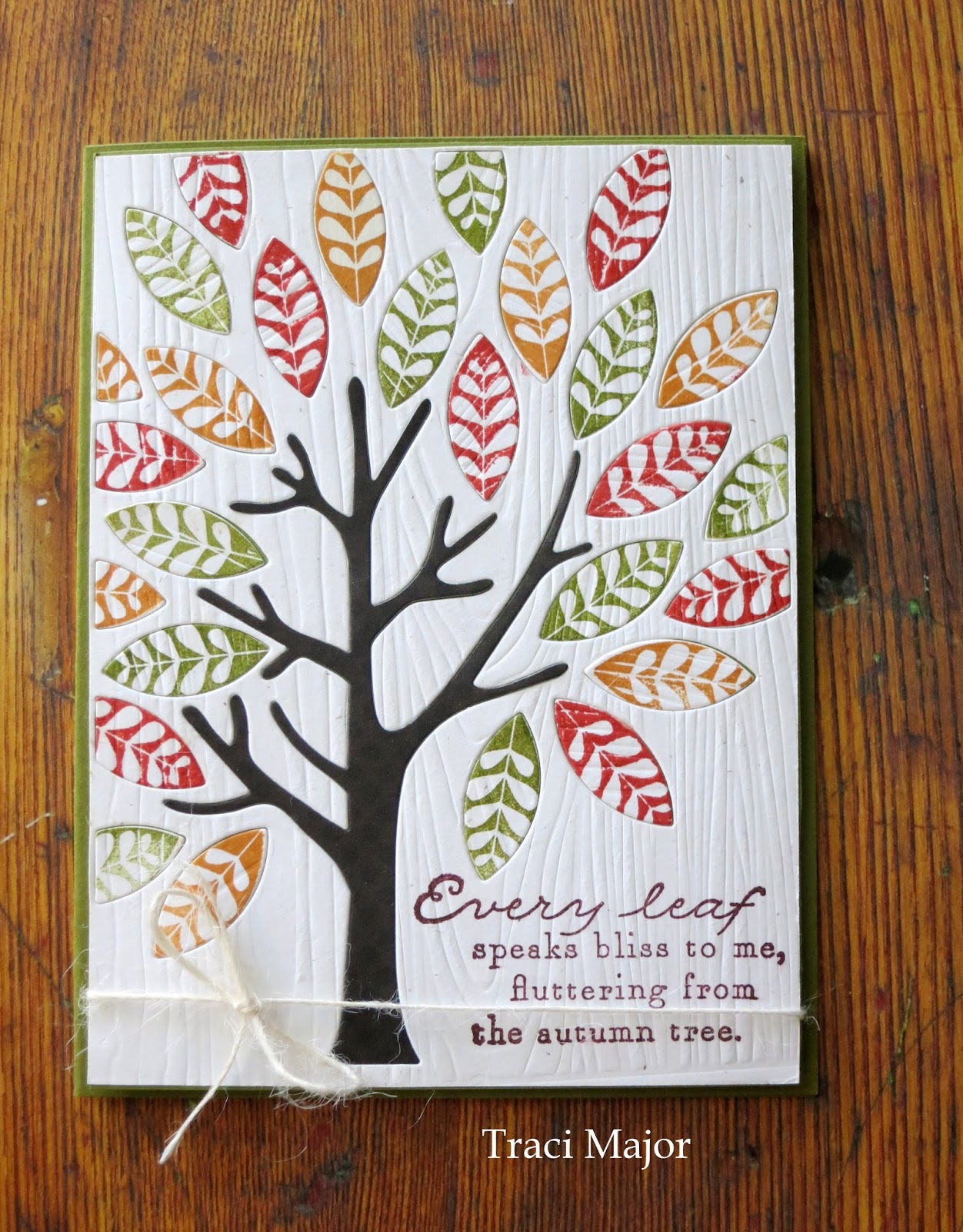
Mighty Oak~Turning Leaves
Hi friends! I am kind of smitten with the PTI set, "Mighty Oak." It is one of the few sets I purchased the accompanying dies as you have all these individual leaves that pop out and you can stamp them in any color you choose, and there are a variety of stamps to add some cool pattern.
For this, I used the PTI website for inspiration and used a wood grain cover plate background to give it some subtle texture. Then went to town stamping leaves and added the sentiment on the bottom and some rustic twine to finish it off.
The dies were cut twice, once with a brown polka dot (used for the tree's trunk,) and then again with the embossed white paper. This card has so much fun texture and color...it doesn't need much embellishing!
Thanks for your visit...I am about to get ready for our neighborhood picnic. I just found out that we are supposed to bring a dessert. Hmmmm...good thing I have our favorite oatmeal cookie dough all rolled into little dough balls in the freezer ready for baking. But too bad I have to share!
Subscribe to:
Posts (Atom)