Showing posts with label watercolor. Show all posts

Friday, May 3, 2019

Pardon My Purple!

Well, it's finally Spring here in Northern Colorado...it has been a very long winter and I am enjoying the past two days of Spring like weather. The Pear trees are bursting forth in bloom and I need to go get a photo of those quick before the wind blows them away! We have Lilacs right under our deck where we have our morning coffee and they are so heavenly when they bloom. I saw Power Poppy had a sale on this set "Lilac Time"  last weekend...and it just reminded me to pull mine out and use it.
It may be hard to see any detail on those blooms as they were gold embossed which left little space for shading, etc...but I used a variety of lilacs and purples using my Zig Markers to watercolor these and also the tiny ladybug on that leaf...so fun! I also used a new to me embossing folder from Stampin" Up on the purple layer...it gives the base a tufted look which is very feminine. The panel was given a gold liquid pen treatment along the edges and then an organza ribbon and matte colored gems were added. The sentiment is from Power Poppy's set, "Potted Primroses."  The entire image was splattered with some of the watercolor and it gave a nice little splattering of color without overwhelming the main image. I had initially created this card for the April challenge but I ran out of time posting it...so here it is. I am sure I will have an occasion to use this!
For some reason a lot of people comment on my purple cards by prefacing that they don't really like purple..but they like my card...which always makes me laugh and hence the title of this post.
I love purple...but lilac is even better in my book!
I am so happy you stopped by and hope you enjoyed your visit. Thank you!
Have a beautiful day and hope you get to be out and enjoying Spring in your part of the world!

Monday, March 11, 2019

An Attempt at Masculine with Altenew Stamps~

Hi visiting friends...I admit I wasn't sure about adding this card to my blog...like any card I make...at first I am smitten with just the joy of seeing ink on paper...but after awhile I felt it might be a little too drab or plain...but I am going to use this as a masculine card and think it works well if I leave well enough alone...and I'm sure you know what I mean.
This is an Altenew image with outline and solid leaf prints. I fell in love with it when I saw the DT samples...however...the reason I finally made the plunge to hit that purchase button  is one single entry on the website that was so unique and beautifully embossed with a triage of powders...but do you think I can find that saved anywhere at all?


So...this is just a plain ole card...stamped and embossed in Copper metallic and colored in with Tim Holtz Distress Inks in three shades. I saw this "blessings" set sitting out and decided at the end to add that along the leaf border and it worked!  Then I dared myself to splatter the ink...and I did...just holding my breath that it didn't make a huge mess and so I went very lightly. I used the rough side of the watercolor paper for more texture. After I was finished, I trimmed the panel on both sides and popped it up on a Kraft card base.
This is an understated card, but the metallic embossing and the bold colors look very masculine to me.
Thanks for visiting me today!! I hope your day is full of blessings!

Friday, March 8, 2019

A Teacup of Spring~

Most of my stamping is for no particular reason...sometimes I come across a stamp that brings a sense of sweetness or nostalgia. This one from Stampavie by artist Tina Wenke does just that!! I see they no longer make the stamps...but there is a spot to find lots of digital which I may try soon! I made a 3x3 note card and added just a bit of designer paper (because that is all I had of this scrap )so it served as a border...and some twine across the top of the card. I practiced my water coloring with this image...using my Zig Markers. Except this time I scribbled my markers on a clear block and then used a brush to add to my panel rather than applying directly. I loved the way it turned out and found it much easier than the times I've attempted with copics. I may try a larger card but for today this is perfect for my needs...just the right size to add a gift card in the mail.
The note card die is from Papertrey Ink. I can tell I will be using this often.
Wishing you a warm and wonderful day filled with a bit of beauty! Thanks so much for your visit today!

Monday, May 29, 2017

Power Poppy Challenge~ Frame It Up!

Hi and welcome to my blog!
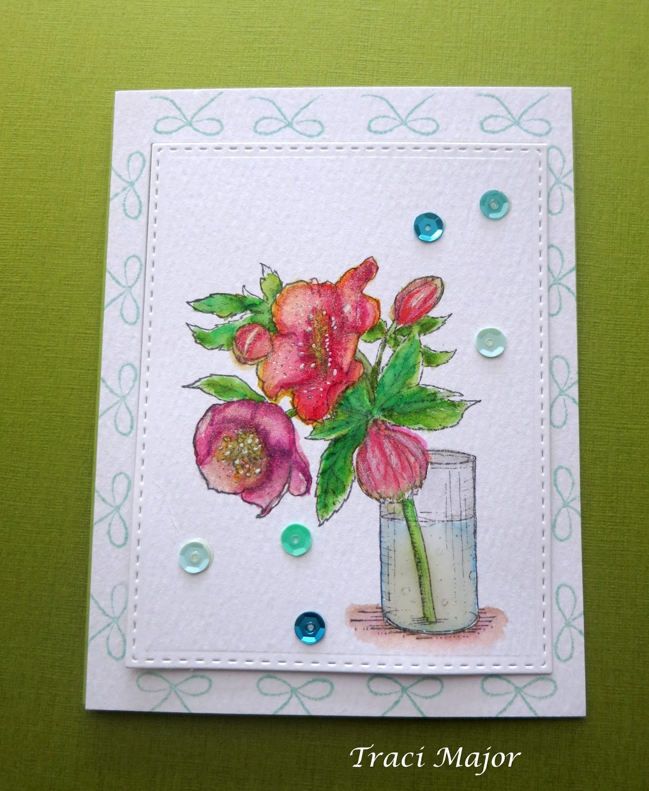
Today I am sharing a couple of framed water colored blooms I made for this month's Power Poppy Challenge~"Frame It Up!"
Both use one of Marcella's images from Flourishes, Lenten Rose.  I wanted some practice water coloring. I am definitely still a beginner; but I love the look!

I think this one, in a variety of  amethysts and purples is my favorite. I framed it very simply and just used a few pearls for embellishment.

I wasn't as happy with the actual coloring of this one; it became muddied after too much work trying to apply layers of color. So I stopped (good idea!) and then went over some of the blooms with prisma pencils for shading. I also used a sweet bow to "frame" the image...kind of a fun look and adds a bit of whimsy!
Thanks so much for looking and always look forward to your comments! Have a blessed day!

Friday, September 30, 2016

Painting Outside the Lines~Power and Sparklette Week 3 Challenge


Hey there, and thanks for stopping by! I had the need for some creative inking; if you know what I mean. I spent a few days just mulling over Marcella's Power Poppy Challenge and after a few swirling ideas; set on this one...water coloring outside the lines! 
I just received this set in the mail not long ago..."Sunny Harvest," and used my Kuretake Gansai Tambi water colors for this. I spent more time on the outside shading and filling in color than the actual image...the colors gave the card a very warm glow which is what I was hoping for. I embossed the image with gold detailed embossing powder and layered shading on the Chinese Lantern blossoms. The little buds didn't receive as much detail...I just added varying shades and later realized those were maybe leaves on the side...not sure...so this is an "artistic rendition" which means me just playing around with color. I added a little white signo gel pen for highlights on the smaller buds. Certainly not perfect...but I still like the result. I stamped the setiment in Versafine Sepia which actually appears a little darker on the card than this photo indicates...but still keeping with the glowing look of perhaps candlelight and parchment?   A few gold sequins were added for some sparkle. I enjoyed this challenge and thank you for your kind comments! Blessings on your day!
Thanks for stopping by my blog today!

Wednesday, February 10, 2016

Power Poppy Challenge: Switch up Your Shades!


This month the Power Poppy challenge from Allison Cope is to use a different coloring medium than you normally do! I normally color images using copics...so this time I stretched myself a little bit and  used reinkers  diluted with water and fine tip paint brushes. The floral image is a SU! hostess set.   I followed a SCS tutorial on the" pleated skirt" fold for the cute paper fold. I made this for my daughter's birthday card and wanted something feminine and flirty. The designer paper is also from SU! The tiny paint splatter look is SU! Gorgeous Grunge which I used to add a bit of texture to my circle die and three sequins in sky blue from Doodlebug found at my local scrap booking store!
Thanks so much for peeking in~wishing you a blessed day!


Thanks for stopping by my blog today!